People cannot find what they need on my website
People do not arrive on your website with a map of how your business is organised.
They arrive with something they want to understand.
They may want to know whether you offer the service they need, whether you work with businesses like theirs, how much something might cost, what the next step involves, where you are based, whether you can be trusted, or how quickly they can get in touch.
Most visitors are not exploring slowly. They are trying to answer a question.
If your website makes that answer difficult to find, trust can start to weaken before the visitor has properly understood what you offer. They may click through a few pages, skim the wrong section, miss the useful detail or leave with the quiet feeling that the site is harder to use than it should be.
That does not always mean your website is empty, badly built or beyond repair.
This is easy to miss from inside the business because you already know where everything is. You know what your service names mean. You know which page answers which question. You know what someone should click next.
A new visitor does not have that context.
So when people cannot find what they need, the issue may not be that the information is missing. It may simply be that the route to it has become unclear. The content may exist, but not in the place, order or language the visitor expects.
That difference matters because a website should not make people solve the structure before they can understand the business. It should help them find what matters, trust what they see and know what to do next.
At Expand Digital Media, we help small and growing businesses improve website structure, wording and visitor routes, so people can find the right information more easily and take the next sensible step with more confidence.
Visitors think in questions, not page structures
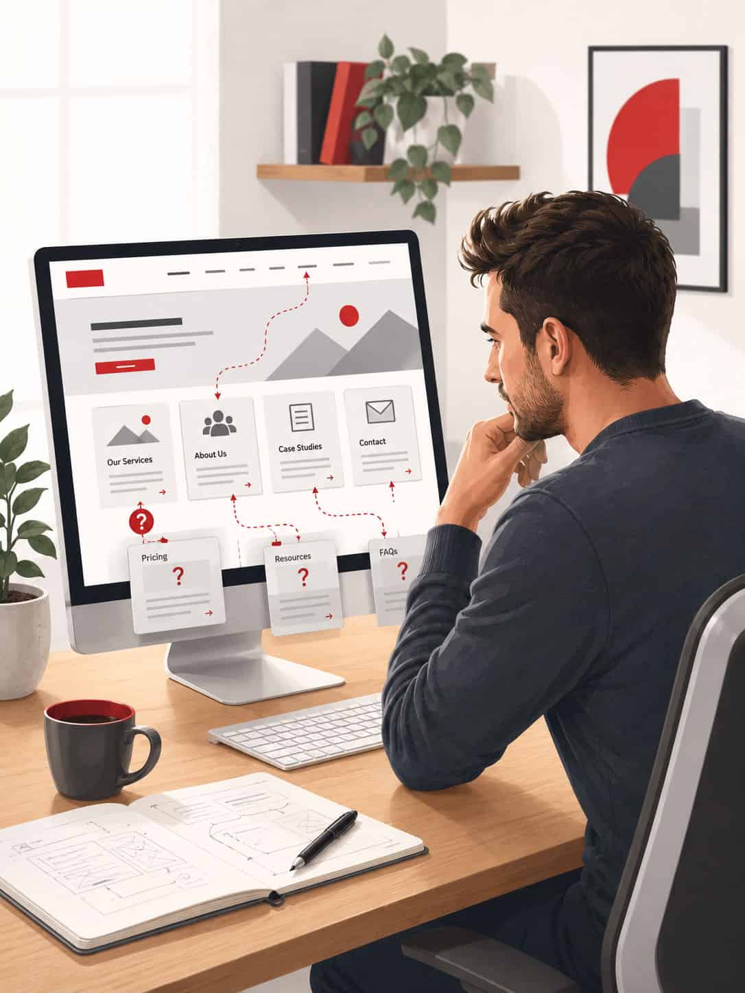
A lot of websites become harder to use because they are organised from the inside out. That is understandable. When you build or update a website, it is natural to start with how the business sees itself: services, packages, departments, tools, processes, categories or internal language. Those things may make perfect sense to the people inside the business because they already understand the offer. Visitors usually start somewhere else. They start with a need, a worry, a comparison or a question. They may not know the right service name. They may not know whether they need a new website, a redesign, better content, SEO, hosting, maintenance or something smaller. They may only know what they are trying to solve. That is where the route can start to break. Someone may not be looking for “website conversion support”. They may simply be thinking, “People visit my website but do not enquire.” They may not be looking for “website information architecture”. They may be thinking, “People cannot find what they need.” They may not search for “content strategy”. They may be wondering, “I do not know what to put on my website.” If the website only reflects the business’s own categories, the visitor has to translate their real-world question into your website’s structure. Some people will manage that. Many will not. They may choose the wrong page, miss the right one, hesitate, or move on to a business that feels easier to understand. A clearer website does more of that work for them. It uses menus, page names, headings, internal links and calls to action that match how people actually think when they are deciding whether a business can help them.Useful information can still be hard to find
This kind of problem often builds up gradually.
A website may start simple and clear. Then the business grows. A new service is added. A page is edited. A blog post answers a useful question. A package changes. A testimonial is placed on one page but not another. A button is added to the homepage. A contact option appears in one place but is not carried through the rest of the site.
None of those changes are wrong on their own.
The problem is that, over time, the website can start collecting useful pieces without the route through those pieces being properly reviewed. From inside the business, that may still feel manageable because you know why each part is there. For someone arriving fresh, it can feel less obvious.
This is why the issue should not be treated as a personal failure or an automatic sign that everything needs replacing.
Sometimes the answer is focused and practical. A menu label may need changing. A homepage section may need clearer signposting. A service page may need stronger headings. Important information may need moving higher up. Related pages may need linking together more clearly. Calls to action may need placing where the visitor is ready for them.
Sometimes the issue is wider, especially if the business has changed significantly since the website was first built. Even then, the sensible first step is not to assume the biggest answer. It is to understand where the route is breaking down and what would make the website easier to follow.
When visitors work too hard, trust drops quietly
Most visitors will not tell you they could not find something.
They will not usually send a message explaining that the menu was confusing, the page names did not match what they expected, the service page did not answer their question, or the mobile version made the next step hard to find.
They will simply leave, delay the decision, compare another business, or send an enquiry that needs far more explanation than it should.
That is what makes this problem difficult to spot. The website may not appear broken. The pages may load, the links may work and the form may submit. But the visitor’s confidence can still weaken while they are trying to make sense of the site.
Your website is often doing the first part of the conversation before you speak to anyone. It should help people understand what you do, whether it fits their situation, why they can trust you and what they should do next.
If the route through the site is unclear, that first conversation becomes harder. The visitor has to piece together the answer for themselves.
The risk is not only that they miss a page. The risk is that they lose confidence while looking for it.
A confusing route can make a capable business feel less organised than it really is. It can make a strong service feel harder to understand. It can make a useful next step feel less obvious. It can make the visitor wonder whether dealing with the business will feel as unclear as using the website.
That may not be fair, but it is often how websites are judged.
The issue is not always the menu
When people cannot find what they need, it is tempting to look only at the navigation menu.
The menu matters, but it is only one part of the route.
A website route is also shaped by headings, page names, service explanations, internal links, section order, proof, mobile layout and calls to action. It is shaped by what the visitor sees first, what they understand next and whether the page gives them enough confidence to keep going.
Sometimes the issue is wording. A service may be described in terms that make sense to the business but not to the visitor. The page may explain what is included, but not who it is for, what problem it helps with or what value it creates.
Sometimes the issue is structure. The right pages may exist, but they may not connect properly. A visitor lands on the homepage and is not clearly guided towards the right service. They visit a service page but are not shown related information. They want reassurance but cannot easily find reviews, examples or proof.
Sometimes the issue is timing. The information appears, but too late. The visitor needs reassurance earlier. They need to understand the service before the contact button appears. They need the next step before they have lost interest.
Mobile can make this even more visible. A website that feels acceptable on desktop may feel harder on a phone if menus are tucked away, sections become long, buttons are easy to miss or important details sit too far down the page.
The better question is not simply, “Does the website have the information?”
It is, “Can people find the answer they need at the point they need it?”
A clearer route makes your website easier to trust
A clearer website does not have to explain everything at once.
It needs to help people move through the right information in a sensible order.
Someone arriving for the first time may need a simple overview before they are ready for detail. Someone comparing services may need clearer page names and more useful explanations. Someone close to enquiring may need proof, reassurance and a next step that feels easy to follow.
When those routes are clearer, the website feels easier to use. More importantly, the business feels easier to understand.
That can affect enquiries, but it can also affect the quality of the conversation. A visitor who can find what they need is more likely to understand which service fits, ask a better question, trust the business earlier and take the next step without needing everything explained from scratch.
This is where website structure connects directly to growth.
Growth is not always about adding more pages, more content or more traffic. Sometimes the first improvement is making the existing journey clearer, so the people already arriving on the website can understand it more easily.
A clear route helps the visitor. It also helps the business owner. It can reduce repeated questions, vague enquiries and the feeling that the website is not quite doing its job. It allows the site to carry more of the early explanation, so conversations can start from a better place.
How Expand Digital Media can help
We can help you look at your website from the visitor’s point of view.
That means looking beyond whether the site technically works and asking whether the journey makes sense to someone arriving fresh. Can they quickly understand what you do? Can they find the right service? Can they see whether you are a good fit? Can they find proof when they need reassurance? Can they understand what to do next?
This may involve reviewing the navigation, homepage route, page names, service pages, mobile experience, internal links, headings, calls to action and enquiry journey. The aim is to find where visitors may be getting stuck, where information is harder to find than it should be, and where the site could guide people more clearly.
The answer does not have to be the same for every website.
For some businesses, a focused improvement may be enough. That might mean clearer menu labels, better headings, improved internal links, stronger service page structure, more useful signposting or better placement of contact routes.
For others, the issue may point towards a wider refresh or redesign, especially if the website has grown in different directions or no longer reflects how the business now works. Even then, the decision should come from understanding the site properly, not from assuming the largest project before looking at the problem.
The purpose is simple: make the website easier to understand, easier to use and easier to act on.


Help people find the right next step
If people cannot find what they need on your website, you do not need to know exactly where the problem sits before asking for help.
You may not know whether the issue is the menu, the wording, the page structure, the mobile layout, the service pages, the proof, the calls to action or the way the site has grown over time. You may simply know that useful information exists, but people still seem to miss it, misunderstand it or struggle to move forward.
That is enough to start.
Share your website URL and a few honest details about what feels unclear, hard to find or difficult to explain. We can look at how the site is guiding people and help you understand what would make the route clearer.
Your website should help people find what matters, trust what they see and know what to do next.