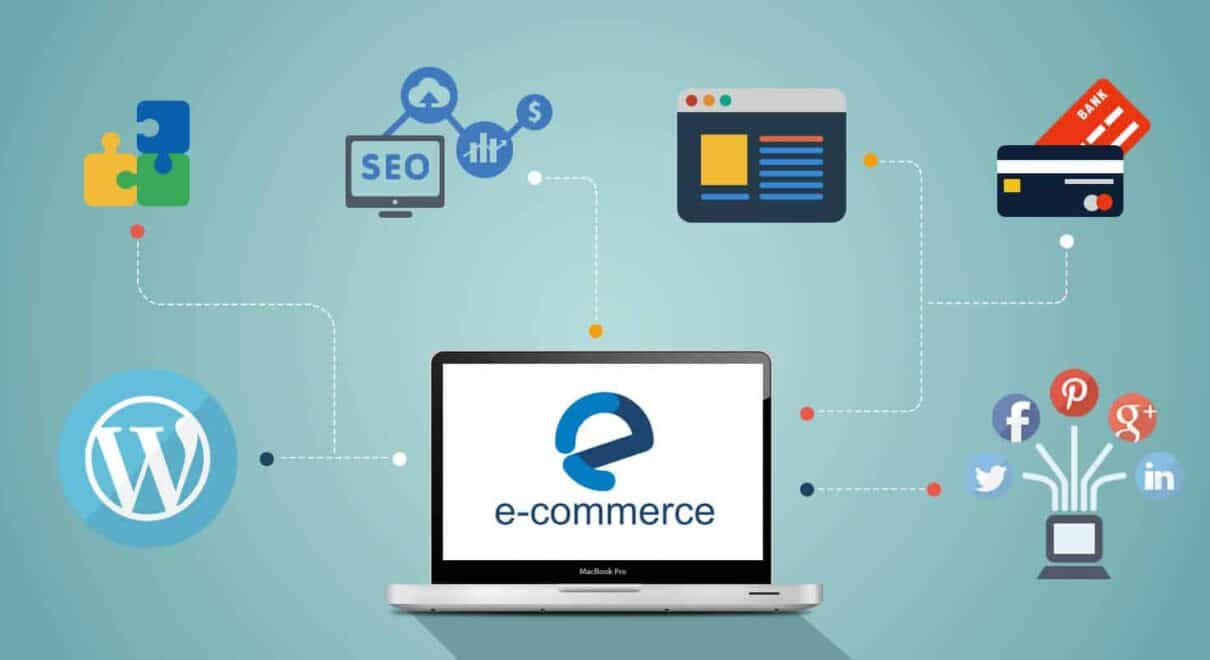
You’re in business to make money. You most likely knew that you can do that with your website. What most ecommerce site owners don’t know, though, is how to make an effective design for their websites and stores. Refusing to learn the basic web design tips means a loss of sales. Here are 8 web design tips for boosting those sales, if done correctly.
- Photography
It should go without saying by now that photography, next to video, is the most important aspect of any store. Without stunning, 4K-quality photos of your products, and of customers enjoying those products, you’re not instilling much faith in your business. - Filtering
Filter everything if your store offers a large variety of products. This will help customers cut down their shopping time; even though the majority of us love shopping, not a lot of us enjoy siphoning through uncategorised pages. Filter each product to a tag and category. - Minimalism
The phrase “less is more” might seem cliché, this day and age. However, it became a cliché in the first place because it is such an effective philosophy. Adapting the minimalist mindset to your website will help you keep clutter to a minimum, keeping customer frustration to a low. Although it’s a lifestyle trend, there’s something to be learned from applying techniques to your website design. The best ecommerce website developers use this to boost conversion rates thanks to the user’s experience. - Easy checkout
People love Amazon for many reasons. One of those reasons? Three clicks. It takes you roughly three clicks to go from your shopping cart to the “order verification” page. Checking out is a breeze. Follow Amazon’s example: don’t make account registration mandatory. Don’t use confusing words in your messages. There’s a reason that shares in the company are over $1,000 a share. - Distractions
Every decision that goes on your website should be comprised of two things: 1) Making sure people are content and happy with you, and 2) Making sure they buy. One such distraction that irks me, on any site, is a screen-filling pop up that prompts me to enter my email in exchange for a newsletter. That little mistake cost that particular ecommerce store a customer. - Videos
Remember when Twitter and Instagram were image-only platforms? Remember how these two social media titans shook the internet when they integrated video into their design? We’re accustomed to video. Your customers are accustomed—and expect—video. As a merchant, you can explain the uses and benefits of your products. Or ask for recorded testimonials from real customers. Or shoot a 15-second “commercial” about your brand’s story. - Navigation
The faster people can get across your website, the better. Nobody—let alone customers—these days has time to poke and prod around a store; online or no. This is why having a menu bar (usually represented by three vertical lines) that’s easy to navigate is key for optimal experience. - On The Grid
Ecommerce stores have a lot to benefit from the grid-style layout. It’s simple: simply organize products according to rows and columns. (Think of an Excel sheet, or the layout of tic-tac-toe.) However, keep a lot of white space around each item. This gives viewers breathing room.
Improving the performance of your website, so it serves customers better, is a never-ending challenge. A challenge that never stops rewarding you with sales upon sales and more sales. As you implement these tactics into your own ecommerce website, keep customers in mind.


